Ever wondered that how your website will look in a mobile device or how to check your website’s appearance in a mobile device? Well, everyone knows the simplest answer, just open it from a mobile phone!
It is the simplest answer of course, but not the most feasible one. Actually there are various reasons to say that, some of them are…
- You use the mobile handset which doesn’t support web browsing!
- You haven’t activated internet services from your mobile service provider. Reasons could be high tariff, bandwidth charge or similar.
- Poor coverage of the mobile network.
- You are a web developer and while developing you want to check the pages frequently on a mobile, without uploading them online!
- You want to check your website in various handsets, of course all major handsets, you cannot buy!
- And other reasons you can think of…
There are various mobile emulators available in the market (belongs to both, paid and free category). One of the best of the lot is Opera Mobile Emulator (by Opera – of course). The latest version is 12 and its quite rich with features. Of course you cannot view source, trace, debug and evaluate code. But the appearance can be checked as if it is in a mobile device. The default interface is much similar to those of iPhone.
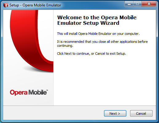
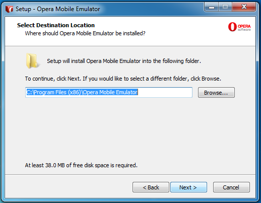
You can find it at http://www.opera.com/developer/tools/mobile/. The installation for Windows is pretty straight forward. And it will occupy around 38MB.
Step 1:
Step 2:
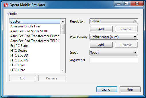
On each start, you can choose from a wide range of Mobile device, to emulate
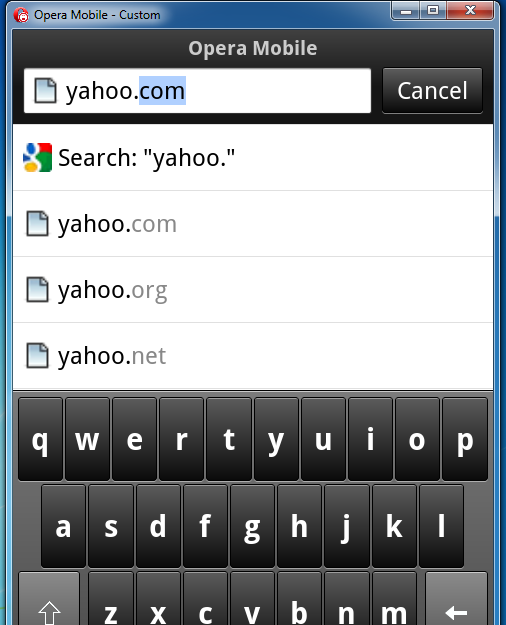
The emulator have almost all the features of a handset. It also generates proper user agent, so for the sites having redirection to the mobile subdomain automatically redirect there. Eg. When you try to open yahoo.com in opera emulator, it automatically redirects to m.yahoo.com. Also the auto-complete web address feature is quite helpful which let you choose from major TLDs and type less text in the address bar.
Final verdict: The application is a must-have for the webdevelopers (even for the website owners).
 ThinkerViews – Views And Reviews Personal views and reviews for books, magazines, tv serials, movies, websites, technical stuff and more.


