Yahoo! – one of the most used portal once, is rising again. And too the customers they seems found a way. Provide a simple, slick and interactive yet attractive user interface.
They keep experimenting with different logos for its most famous service, Yahoo! Mail.
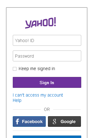
Here are what we found on Yahoo! Mail’s home page.

Yahoo! Mail New Logo – Round 3 – Login Page
And this is what it is found inside the inbox.

Yahoo! Mail New Logo – Round 3 – Inbox
Seems they will continue experiment the stuff as we have predicted in the previous article of the series. And as now you all aware with the same; unless we found something major attractive in this regards, we will not be shouting that again.
By the way, which version of the logo you liked the most? We, like the first version more than the others.
 ThinkerViews – Views And Reviews Personal views and reviews for books, magazines, tv serials, movies, websites, technical stuff and more.


